 Scrollify
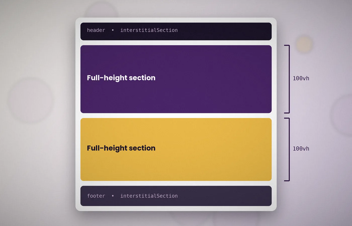
Real websites rarely consist of full-height panels alone. They have headers, footers and occasional short bands of content.
Scrollify handles these with two settings: interstitialSection and offset.
What an interstitial section is
An interstitial section is a block that sits among the panels but keeps its own natural height. Scrollify still snaps to it, but does not stretch it to fill the window.
Footers are the most common example. Stretching a footer to full height would leave an awkward empty screen.
Adding a footer
Give the footer its own class and pass it to the option. Scrollify adds interstitial selectors to its list of sections automatically, so the main section selector can stay unchanged.
$.scrollify({
  section: ".panel",
  interstitialSection: ".site-footer"
});
When the visitor scrolls past the last panel, the page moves just far enough to reveal the footer.
Working with a fixed header
A fixed header sits above the content and can hide the top of each panel. Use a negative offset equal to the header height to compensate.
$.scrollify({
  section: ".panel",
  offset: -72
});
Alternatively, add top padding to every panel equal to the header height. This approach also suits translucent headers, because the panel background still runs behind them.
A static header at the top
If the header scrolls away with the page, treat it as an interstitial section, just like the footer.
$.scrollify({
  section: ".panel",
  interstitialSection: ".site-header, .site-footer"
});
Short content bands
A quote, a logo strip or a call to action may only need 300 pixels. Mark these blocks as interstitial too, so they keep their compact height.
Use them sparingly. Several short bands in a row make the snapping rhythm feel uneven.
Order matters
Scrollify reads sections in document order. Make sure the header comes first and the footer last in your markup, and avoid nesting sections inside one another.
Checking the result
- Scroll to the bottom and confirm the footer appears fully without an empty gap.
- Scroll back up and check that the last panel settles correctly.
- With a fixed header, confirm that each panel's heading remains visible.
Combining with section names
Interstitial sections can carry section names too. A footer named contact lets a menu link jump straight to it.
<footer class="site-footer" data-section-name="contact">...</footer>Classify each part of the layout
Before choosing selectors, identify which elements are full-height story panels, which are natural-height destinations, and which are fixed interface controls. A normal footer belongs to the document flow; a fixed navigation bar is an overlay. Treating those two elements as equivalent creates confusing measurements because the overlay does not occupy the same kind of space as a normal block. Sketch the page order using actual content rather than placeholder rectangles. A compact legal footer, a newsletter band, and a contact panel may each need a different role even though all three happen to appear near the bottom of the design.
Keep fixed headers out of the destination sequence
A header that stays attached to the viewport usually should not become a separate scroll destination. Its job is to provide controls while other content moves underneath it. Include a header as an interstitial only when it is a genuine block in the document flow that you want navigation to visit. Inspect the computed position value and the rendered layout rather than relying on the component's name. A class called site-header can describe either arrangement. This distinction matters when a responsive design changes the header from static on a narrow screen to fixed on a wider one.
Choose one compensation strategy first
There are two common ways to prevent a fixed header from covering content: alter the landing position or reserve space inside the panel. Begin with one strategy, measure the result, and introduce the other only for an explained reason. Padding keeps the panel background extending behind the overlay while moving its inner content down. Offset changes scrolling geometry and deserves checks across the whole destination sequence. Applying both without accounting for their combined effect can produce a conspicuous empty strip. Use actual header dimensions rather than a number copied from a mockup, especially when the header wraps or changes size on mobile.
Make short blocks genuinely natural in height
An interstitial block should be sized by its content and intended spacing. Remove inherited viewport-height rules from shared classes that would otherwise stretch it. A footer can be configured correctly in JavaScript and still appear full-screen because its stylesheet gives it a large minimum height. Inspect the final computed styles, including rules inherited through a utility class. Give the block enough internal padding for comfortable reading without using empty height as a positioning tool. The point of a natural-height destination is to respect the space its content needs, which may increase when links wrap or a translation uses longer words.
Understand the bottom-of-document limit
The browser cannot scroll beyond the document's maximum scroll position merely to place a short footer at the top of the viewport. The final landing may therefore show the bottom of the preceding panel together with the footer. That is often a correct result rather than a measurement failure. Judge whether all footer content is visible and usable instead of expecting every destination to align identically. If the design requires a full-screen final composition, create an actual final panel with enough content or spacing to justify that height. Do not add arbitrary blank space simply to disguise a misunderstanding of the document boundary.
Keep document order and visual order aligned
Scrollify follows the selected elements in document order. CSS techniques that visually rearrange content can make that sequence appear inconsistent to a reader. Keep the main panels, short bands, and footer in a logical order in the HTML. Avoid absolutely positioning a natural-height footer into a location that no longer matches its place in the flow. A predictable order also helps keyboard navigation and reading without JavaScript. When the layout changes between columns and a stack, check that the same narrative sequence survives. The scrolling script should not have to compensate for a document whose visual order contradicts its structure.
Give named footers a clear navigation purpose
A named footer can provide a useful contact destination when it contains genuine contact information. However, do not give unrelated blocks the same section name simply because they both mention contact. Each destination should be unique and stable. Check the menu link from the first panel and from a nearby panel, then reload the page with the footer fragment already present. If the footer only contains legal links, an ordinary link to a dedicated contact page may communicate the purpose better than a panel jump. Choose the destination around the visitor's task rather than around the convenience of an available selector.
Account for changing header dimensions
Headers can become taller when a logo loads, navigation wraps, a notice appears, or text is enlarged. If your landing calculation depends on their height, update that calculation after a meaningful change. Avoid reading layout on every wheel event. A resize handler or a carefully scoped observer can respond to actual dimension changes, provided it is cleaned up when the view ends. Also test the state with the mobile navigation expanded. A fixed overlay that covers half the screen needs sensible close behaviour and focus management; changing Scrollify's offset alone cannot make an obstructive menu comfortable to use.
Protect the footer's keyboard access
The footer often holds links that appear nowhere else, including privacy information and contact details. Reach those links with Tab, Shift+Tab, and ordinary browser scrolling. Confirm that a fixed header, cookie notice, or floating button does not cover the focused link. If the final block becomes taller than the viewport, every row must remain reachable without depending on a perfectly timed gesture. Test enlarged text and a short landscape viewport, where footer columns can produce much more vertical content than expected. A successful final transition is only the start of the check; the individual controls inside the destination must work as well.
Use spacing that survives content changes
A footer aligned with a negative margin or a hard-coded empty spacer may look correct for one language and one screen size, then break as soon as its links wrap. Prefer normal flow, consistent padding, and explicit layout rules for the footer's internal columns. Let grid or flexbox handle their arrangement while the footer itself keeps natural height. Check the design using real link labels and the longest legal text. Placeholder content frequently understates the space required. When you remove a footer link, revisit the column balance without reducing the remaining links' clickable area or making their labels unnecessarily small.
Test the transition in both directions
A short footer can appear correct when entered from above but expose a different problem when leaving it. Move from the penultimate panel to the final panel, into the footer, back to the final panel, and then upward again.
Keep ordinary reading pages independent
A site can use a panel-based landing page while its detailed guides and policy pages retain ordinary scrolling. Do not initialise Scrollify globally merely because the shared footer appears on every page.
Frequently asked questions
Should a fixed header be an interstitial section?
Usually it should remain an overlay outside the destination list. A header that scrolls naturally with the document can be an interstitial if that matches the intended navigation. Inspect its actual CSS positioning, since the component name alone does not tell you its layout role.
Why does a short footer stop below the top edge?
The browser is limited by the end of the document. A short final block may be fully visible without reaching the top of the viewport. Check content access rather than assuming identical alignment is possible for every destination.
Can a footer have a shareable section name?
Yes. Give it a unique name and verify direct page loads as well as menu navigation. Ensure the label describes what visitors will find there. Keep that name stable after publication so saved links continue to point to the intended destination.
Why is my interstitial still full height?
Inspect CSS rules such as min-height, height, and shared utility classes. The JavaScript option cannot undo every unrelated stylesheet decision. Remove conflicting viewport-height styling from the natural-height block, then refresh measurements and test again.
Conclusion
Separate full-height panels, natural-height destinations, and fixed overlays before choosing configuration. Use interstitial sections for real document blocks, compensate for headers deliberately, and test the final boundary in both directions. A complete layout succeeds when every heading, footer link, and form control remains visible and reachable.