 Scrollify
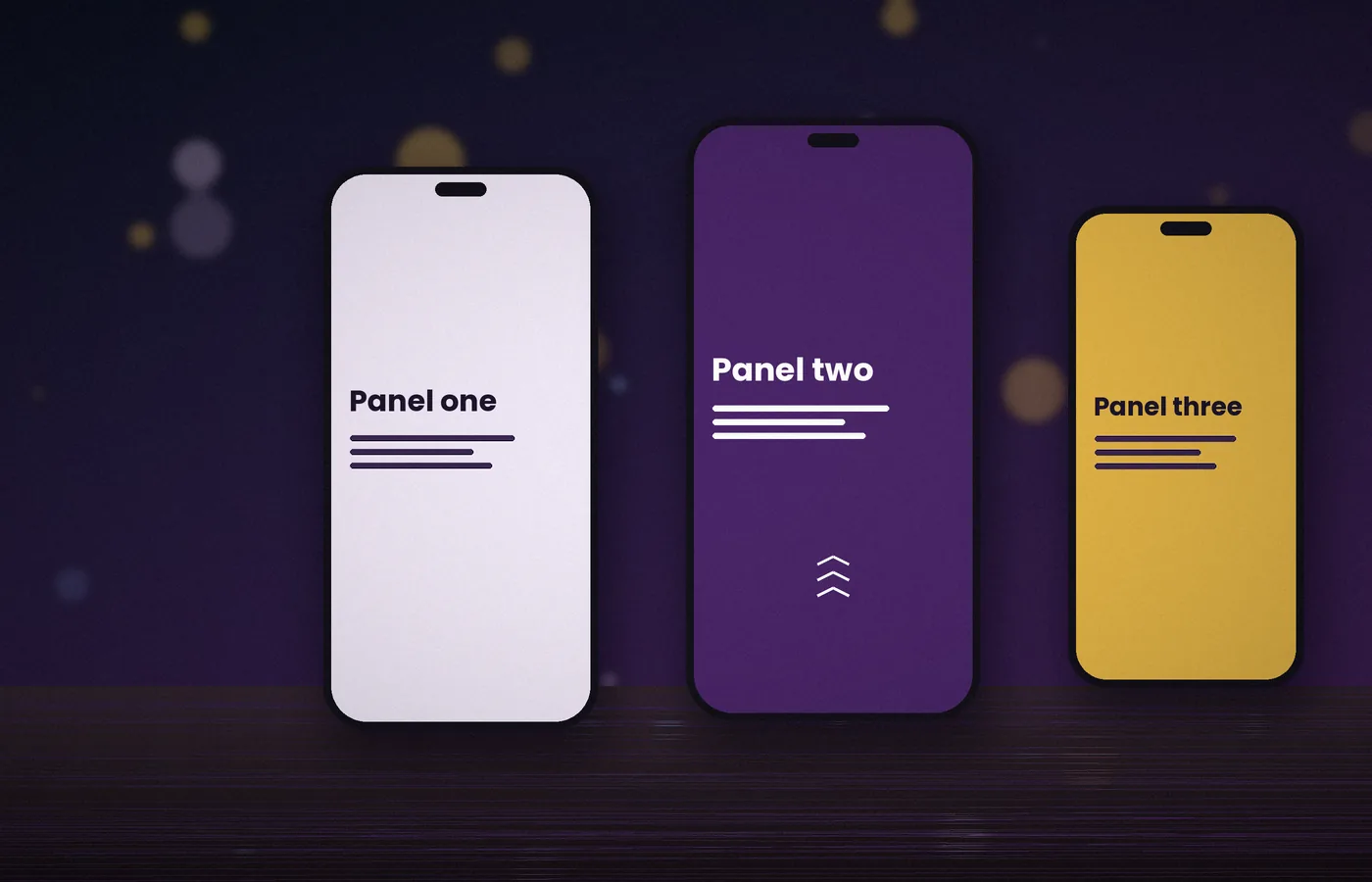
Scrollify is touch-optimised, so swipes on phones and tablets move between sections just as the mouse wheel does on a desktop. Even so, small screens bring their own challenges.
This guide explains how to keep the experience comfortable on every device.
How touch scrolling works
With touchScroll enabled, Scrollify listens for vertical swipe gestures. A short, decisive swipe moves to the neighbouring section.
Inside a section taller than the screen, ordinary scrolling continues until the visitor reaches the edge. The next swipe then moves on to the following panel.
Dealing with mobile viewport height
Mobile browsers show and hide their address bars as you scroll, which changes the available height. Panels can appear to jump slightly when this happens.
Two approaches help:
- Let Scrollify keep setting heights, and call
$.scrollify.update()in a debounced resize handler. - Or set
setHeights: falseand usemin-height: 100dvhin CSS, which follows the dynamic viewport.
.panel { min-height: 100vh; min-height: 100dvh; }Designing panels for small screens
A panel that works on a laptop may overflow on a phone. Reduce heading sizes, stack columns vertically and keep copy short.
Leave space at the bottom of each panel. Many phones place gesture bars or toolbars there, which can obscure buttons.
When to disable snapping on mobile
Snapping suits visual storytelling. For text-heavy pages, many visitors prefer the native scroll they are used to.
You can turn off touch handling alone:
$.scrollify({ section: ".panel", touchScroll: false });Or disable the plugin below a breakpoint:
var mq = window.matchMedia("(max-width: 767px)");
function apply() {
  mq.matches ? $.scrollify.disable() : $.scrollify.enable();
}
mq.addEventListener("change", apply);
apply();
When disabled, use a scoped media-query rule such as .panel { height: auto !important; } to override assigned inline heights when needed, so that short sections do not leave large empty gaps.
Interactive elements inside panels
Maps, carousels and scrollable lists capture touch gestures of their own. List them in standardScrollElements so the plugin leaves their gestures alone.
$.scrollify({
  section: ".panel",
  standardScrollElements: ".map, .carousel, .code-sample"
});
Testing on real devices
Desktop emulators do not reproduce momentum scrolling or address bar behaviour faithfully. Test on at least one iPhone and one Android phone before launch.
- Swipe gently and firmly to check that both move exactly one panel.
- Rotate the device to confirm heights recalculate.
- Open a shared link with a hash to ensure it lands on the right panel.
Performance tips
Large background images slow down transitions on older phones. Serve compressed WebP files, size them for mobile, and avoid heavy blur or shadow effects on moving panels.
Choose the mobile experience before adjusting gestures
Start by deciding whether a small-screen visitor benefits from section snapping at all. A short visual presentation may work well, while a long explanation or a complicated form often benefits from ordinary scrolling. This is a content decision as much as an input decision. Compare the same page with snapping enabled and disabled using real copy, images, and controls. Ask whether visitors can comfortably stop halfway through a section and whether the movement helps them understand the story. If the effect adds effort without adding orientation, a natural document layout is a valid mobile design rather than a reduced version of the desktop page.
Distinguish screen width from input capability
A narrow window is not necessarily a phone, and a wide display can still support touch. Tablets, convertible laptops, and external displays make a single mobile breakpoint an imperfect description of input. Use width to decide layout, and consider input capabilities and motion preferences separately when choosing behaviour. Avoid assuming that every touch-capable device must lose keyboard or wheel support. Write one policy function that combines your actual requirements, then test a few mixed cases. The aim is predictable behaviour for the current interaction, not a device label inferred from one property that happens to be easy to query.
Understand the different viewport units
Mobile browser controls change how much of the page is visible. Traditional viewport units, small viewport units, and dynamic viewport units describe different sizing choices. Dynamic sizing follows available space but can cause visible layout changes as browser controls appear or disappear. A stable minimum can feel calmer for reading, while a dynamic panel may better fit a visual composition. Choose deliberately and test your supported browsers rather than treating one unit as a universal fix. If CSS owns panel heights, configure Scrollify accordingly. A correct CSS declaration cannot resolve contradictory inline dimensions or stale section measurements on its own.
Handle orientation and keyboard changes
Rotating a phone changes both available width and height. Opening the on-screen keyboard can reduce the visible area even more dramatically. Test forms in landscape and portrait, including the final input and submit button. Do not automatically navigate away from a field merely because a resize occurred. Recalculate layout only as needed and preserve the person's current task. A fixed header that is comfortable in portrait may dominate a short landscape viewport. Consider a more compact header or ordinary scrolling in that state. The page must remain usable while the keyboard is present, not just after it has been dismissed.
Keep real content inside the safe visible area
A design checked with a short heading can fail once real copy wraps across four lines. Use the longest expected heading, useful button labels, and realistic error messages when reviewing panels. Add enough spacing around fixed controls and account for devices with safe-area insets where the design reaches the screen edge. Avoid placing the only action flush against the bottom boundary. Confirm that the last line can be read without dragging against a gesture area. Small-screen layout is about preserving access to every piece of content, not merely shrinking typography until a desktop composition seems to fit.
Use natural heights when snapping is disabled
Disabling input interception does not automatically establish the layout you want. If the plugin previously assigned fixed heights, your responsive CSS may need to restore natural flow or you may need a deliberate lifecycle change. A blanket height override can also be wrong if it accidentally targets an independently sized media component. Scope the rule to the actual panels and test the resulting computed dimensions. Keep minimum-height presentation rules separate from the reading layout. Switch between modes more than once while testing: a page that looks correct only after a fresh reload may have an incomplete enable-and-disable policy.
Test scrollable widgets from their actual children
A map, a carousel, a code pane, or a long list may need its own gestures. Check where events originate inside the rendered component, including buttons, captions, and nested wrappers. Configure standard scrolling exceptions precisely and verify both the beginning and the end of an inner scroll region. Broad exceptions can make most of a panel stop snapping, while narrow ones may miss a nested event target. Do not assume that a successful wheel test proves touch behaviour. A component's own gesture handling can differ by input, so examine the interaction on the device that your visitors will actually use.
Preserve browser and accessibility controls
Users should still be able to zoom, select text, follow links, and move focus to form controls. Avoid disabling these capabilities merely to make a swipe effect appear more consistent. Test with increased text size and with a keyboard connected to a tablet when possible. A reduced-motion preference may apply on any screen size, so include it in your behavioural policy independently of the mobile breakpoint. Keep visible focus indicators and sensible reading order. A polished transition is only valuable when the underlying document remains navigable by people who interact with the page differently from its designer.
Budget images for mobile rendering
A compressed image can still be expensive when its decoded dimensions are much larger than the screen needs. Provide appropriately sized sources, reserve aspect ratios, and avoid loading every large visual before the first panel becomes usable. Lazy loading later media is useful, but it should not cause sudden changes to section geometry. Use placeholders with known dimensions and refresh measurements after meaningful changes. Check the page on a slower connection as well as a slower device, because download delay and rendering cost are different problems. Large fixed backgrounds, blur effects, and layered shadows also deserve testing during actual movement.
Use event-driven measurements carefully
A resize listener that immediately calls update for every event may do unnecessary work while browser controls animate. Debounce or otherwise limit your own expensive responses, and first understand which recalculations the plugin already performs. Do not attach several nearly identical handlers from different components. Keep one clearly owned policy for layout refresh and remove its listeners when the view is destroyed. If a particular asset changes height, responding to that known event can be more reliable than continuous polling.
Create a repeatable device test
Write a short route through the page: open a direct link to the middle panel, swipe forward twice, reverse direction, open the menu, follow a destination, and submit an incomplete form. Repeat after rotating the device and after returning from another browser tab.
Provide a useful fallback
A page should remain understandable when snapping is unavailable, disabled, or intentionally declined. Keep all content in normal document order, avoid hiding panels by default, and ensure navigation has meaningful destinations.
Frequently asked questions
Is touchScroll false the same as disabling Scrollify?
No. It changes touch handling rather than defining a complete responsive layout. Review assigned heights, keyboard and wheel behaviour, and any custom navigation separately. Use a coherent policy for the experience you want instead of treating one setting as a universal mobile switch.
Will desktop device emulation be enough?
It helps check layout but does not reproduce every touch gesture, browser toolbar change, or on-screen keyboard interaction. Test at least representative real devices when possible. Record the exact interaction that fails so you can repeat it after a change.
Should I force every mobile panel to one screen?
Only when real content fits comfortably under your supported conditions. Enlarged text, landscape orientation, and form messages often require more space. Let content remain reachable and prefer ordinary scrolling when a rigid panel would obscure essential information.
Does reduced motion apply only to phones?
No. Treat it as an independent user preference on every screen size. Consider disabling animated snapping or using instant navigation for explicit controls, while keeping headings, links, and the complete document available in a predictable reading order.
Conclusion
Choose mobile behaviour around the content and the visitor's task. Coordinate touch policy, natural heights, viewport changes, and motion preferences, then test real interactions on representative devices. Section snapping should support the experience while ordinary scrolling remains a dependable way to reach every essential destination.