 Scrollify
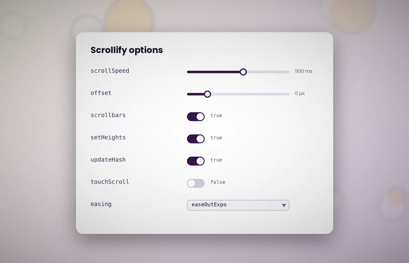
Scrollify works with a single option, yet it offers a dozen more for shaping how scrolling feels. Knowing what each one does saves a great deal of trial and error.
The defaults below come straight from the plugin source. You only need to pass the settings you wish to change.
The default configuration
$.scrollify({
  section: ".example-classname",
  sectionName: "section-name",
  interstitialSection: "",
  easing: "easeOutExpo",
  scrollSpeed: 1100,
  offset: 0,
  scrollbars: true,
  standardScrollElements: "",
  setHeights: true,
  overflowScroll: true,
  updateHash: true,
  touchScroll: true
});
Selecting sections
section
A CSS selector for the panels. This is the only required option. Use a dedicated class rather than a generic tag so that other page elements are never caught by mistake.
sectionName
The name of the data attribute that holds each panel's hash. With the default, Scrollify reads data-section-name. Use updateHash: false when you want to stop automatic address updates.
interstitialSection
A selector for blocks that should not be full height, such as a header or footer. The header and footer guide explains this option fully.
Controlling motion
easing
The animation curve. Scrollify ships with easeOutExpo, which starts quickly and settles gently. Other curves require the jQuery Easing plugin.
scrollSpeed
The duration of each transition in milliseconds. Values between 700 and 1100 feel natural; anything above 1500 tends to feel sluggish.
offset
A pixel value added to each section's position. A negative offset is useful when a fixed header would otherwise cover the top of every panel.
Managing the page layout
scrollbars
Whether the browser scrollbar remains visible. Hiding it creates a presentation-style feel but removes a familiar cue, so keep it visible on content-heavy pages.
setHeights
When true, the plugin sets each section to the window height. Turn it off if your CSS already controls heights, for example with 100vh or 100dvh.
overflowScroll
Allows normal scrolling inside a section whose content is taller than the screen. It is automatically disabled when scrollbars is false.
standardScrollElements
A selector for elements that need ordinary scrolling, such as embedded maps, code panes or long tables. Scrollify ignores gestures that begin inside them.
URLs and input
updateHash
When enabled, the address bar updates as panels change, which allows visitors to bookmark or share a specific section. The plugin uses history.replaceState, so the back button is not flooded with entries.
touchScroll
Controls whether Scrollify handles touch gestures. Set it to false if you want native scrolling on touch devices while keeping snapping on desktop.
Callback options
Four functions can be passed alongside the settings above: before, after, afterResize and afterRender. They are covered in the callbacks guide.
A practical configuration
The following setup suits a typical landing page with a fixed 72-pixel header:
$.scrollify({
  section: ".panel",
  interstitialSection: ".site-footer",
  scrollSpeed: 900,
  offset: -72,
  standardScrollElements: ".map, .pricing-table"
});
Changing options later
You can adjust settings after initialisation with $.scrollify.setOptions(). Pass an object containing only the values you wish to change.
$.scrollify.setOptions({ scrollSpeed: 600 });Treat settings as answers to specific problems
A configuration object is easier to maintain when every non-default value has a reason. Begin with the section selector and use the page for a few minutes before changing motion, heights, or input handling. Record the symptom that each additional option solves, such as a heading hidden under a fixed navigation bar. This prevents a copied demonstration object from becoming an unexplained collection of switches. It also makes later redesigns safer: a maintainer can decide whether the original condition still exists instead of preserving a value because nobody remembers why it was added. Small configurations are usually easier to verify.
Separate geometry from presentation
Some settings affect where the page moves, while others affect the experience of getting there. A wrong destination should be investigated through section selection, content height, interstitial blocks, and offset before experimenting with easing. A visually slow transition belongs to duration or animation design. Mixing those investigations wastes time because a slower animation can make an incorrect landing look smoother without making it correct. Inspect the destination after movement has finished and compare it with the expected heading position. Then judge the animation separately. This distinction gives each change an observable result and avoids an endless cycle of arbitrary speed adjustments.
Understand the consequences of offset
Offset deserves careful testing because it participates in the plugin's geometry rather than acting as a purely decorative margin. A fixed header's visible height is a sensible starting point, but confirm the result on the first panel, a middle panel, and the footer. The first destination and the document's maximum scroll position can behave differently from an unrestricted middle destination. Also consider the padding already applied by your stylesheet. Applying both a compensating offset and equivalent structural spacing without checking them together can create a visible gap. Revisit the calculation whenever the header changes height at a responsive breakpoint.
Make one system responsible for heights
If Scrollify assigns panel heights, avoid contradictory fixed heights in the stylesheet. If your CSS owns sizing, disable automatic height assignment and give panels an appropriate minimum height rather than assuming content will always fit. The two approaches can both be useful, but mixing their responsibilities makes resize behaviour difficult to diagnose. Test the longest panel with enlarged text and a reduced browser height. A panel that needs extra room must remain readable. Choosing CSS-controlled heights does not remove the need to refresh cached positions after substantial layout changes; it simply changes which system determines the elements' dimensions.
Keep scrollbars as a usability decision
A visible scrollbar tells readers where they are and offers a familiar way to navigate. Hiding it changes that experience and also interacts with overflow handling. Before choosing a presentation-style layout without a scrollbar, test every panel at a height smaller than your design mockup. Verify that longer content, form messages, and the footer are still reachable. If the interface depends on every panel fitting exactly, it is vulnerable to zoom, translation, and mobile keyboards. For most public pages, retaining the scrollbar is a straightforward way to preserve an alternative navigation route while still offering section transitions.
Limit standard scrolling exceptions precisely
An exception selector should identify an actual independently scrollable or interactive region. A very broad selector can accidentally exempt an entire panel and make snapping appear intermittent. Conversely, a selector aimed only at an outer wrapper may not cover the event target you expected. Inspect where gestures begin inside the real widget, including controls nested several levels down. Test wheel, touch, and keyboard interaction separately rather than assuming an exception provides identical behaviour for every input. Keep the exception list close to the corresponding component styles so a future markup change prompts a review of both the widget and the scrolling configuration.
Choose duration through interaction testing
Scroll speed is expressed as a transition duration, so the number alone cannot describe how a page feels. The travel distance, easing curve, input device, and frequency of navigation all matter. A deliberate transition can work in a short visual presentation and feel obstructive in a page someone visits repeatedly. Ask a tester to move several panels, reverse direction, and use a menu destination before judging the result. Avoid presenting any particular duration as a universal performance guarantee. Select a value that suits the content, then provide an alternative for visitors who prefer reduced movement or ordinary document scrolling.
Distinguish touch handling from disabling the plugin
Turning off touch handling affects how Scrollify responds to touch gestures; it does not automatically undo panel heights, remove every listener, or establish your complete mobile layout. Disabling snapping is another operation, and destroying the instance has a different lifecycle again. Choose the smallest intervention that delivers the intended experience. A mobile reading layout may need CSS-controlled natural heights as well as a different input policy. Test an actual phone after applying the policy, including landscape orientation and form entry. A narrow desktop window is useful for layout checks but cannot reproduce every interaction of a mobile browser.
Coordinate URL settings with navigation
Section names, address updates, and menu actions need a consistent policy. Keeping readable names can still be useful when automatic hash updates are disabled, since your own controls can target named sections. If another application component owns the URL fragment, decide which component has authority before enabling both systems. Test a page opened directly with a fragment and a page reached through an internal menu. Browser history should also be part of the check: the ability to share a destination and the number of history entries are related design questions, but they are not identical requirements.
Change runtime settings conservatively
Runtime option changes are convenient when a header shrinks or a responsive mode changes, but updating a setting is not always equivalent to rebuilding the whole page. If a change affects layout, verify the resulting measurements and refresh them when needed. Keep the initial configuration in one place and put runtime adjustments in a clearly named function. Avoid several unrelated components repeatedly overwriting the same option. When a transition is already running, schedule structural changes carefully so that its destination is not invalidated halfway through.
Frequently asked questions
Should I copy every default into my settings?
Only copy the values you intentionally change. A smaller object highlights the decisions your project owns and makes reviewing later changes easier. If you maintain an internal reference of defaults, keep it separate from the live configuration and identify the plugin version it describes.
Does disabling automatic heights prevent overflow?
No. It gives your CSS responsibility for sizing. Content can still exceed the screen, especially with enlarged text or a mobile keyboard. Use natural layout and suitable minimum heights, then confirm that all text and controls remain accessible in the smallest supported viewport.
Will a different easing curve repair incorrect landing positions?
No. Easing affects the transition over time; it does not correct a wrong selector, stale measurements, or misplaced header compensation. Inspect geometry first when a panel lands in the wrong place. Adjust animation timing only after the final destination is correct.
How do I know a configuration is ready?
Test all destinations, direct links, forward and reverse navigation, responsive changes, and long content. Check at least one touch device and keyboard-only interaction. A configuration is ready when those user journeys work, rather than simply when the console shows no errors.
Conclusion
Change settings to solve observed problems, and keep each decision explainable. Separate geometry from animation, choose a clear owner for heights and URLs, and test the full destination sequence. A small configuration verified against real content is easier to maintain than a large collection of copied defaults.