 Scrollify
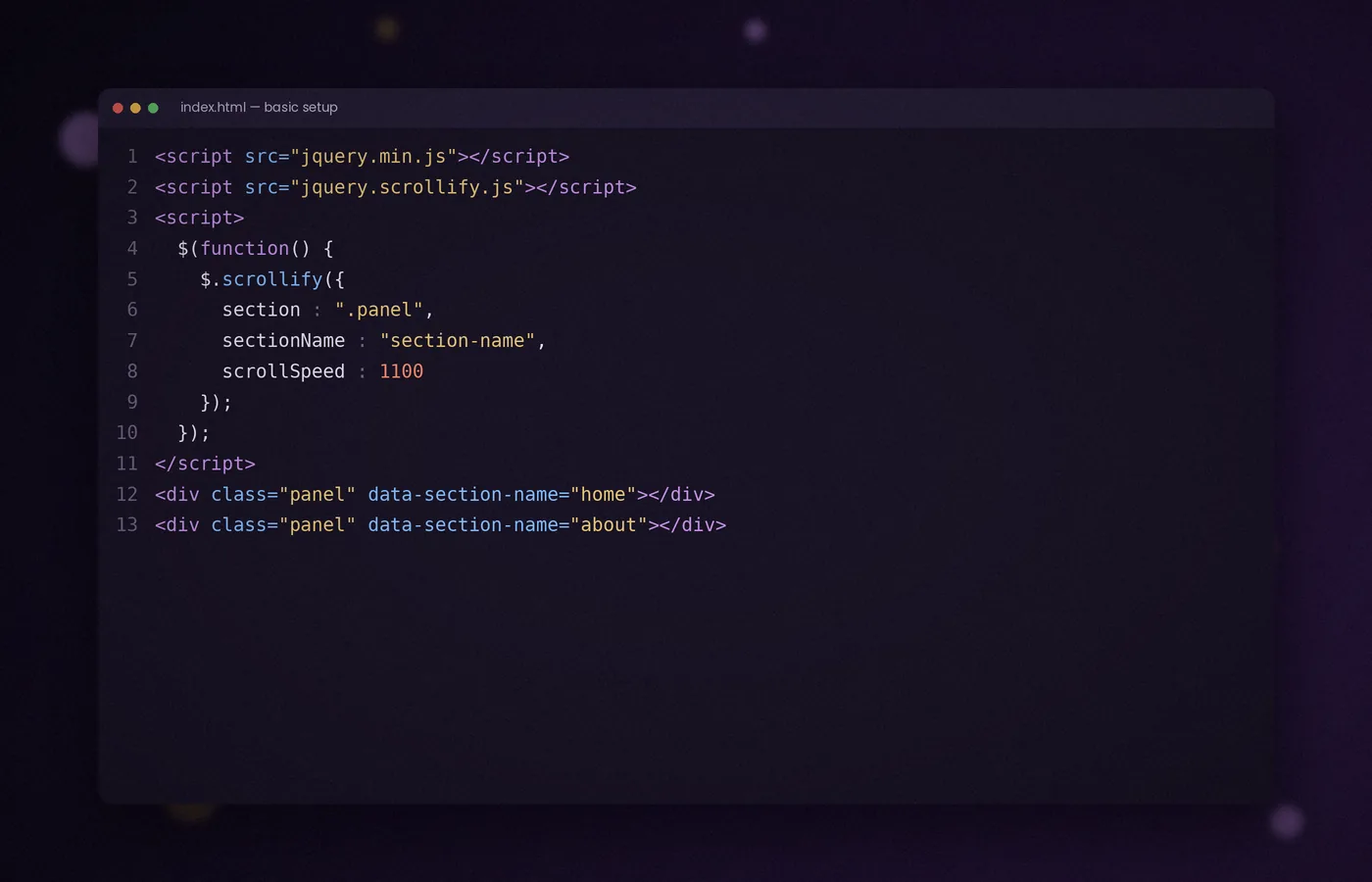
A basic Scrollify page needs three ingredients: a set of sections, a little CSS and a single call to $.scrollify(). This article walks through each one.
By the end, you will have a page that moves one full-height panel at a time with mouse wheel, keyboard and touch input.
Step 1: write the markup
Give every section the same class. Scrollify does not care which element you use, so div, section or article all work.
<section class="panel" data-section-name="home">
  <h1>Welcome</h1>
</section>
<section class="panel" data-section-name="work">
  <h2>Our work</h2>
</section>
<section class="panel" data-section-name="contact">
  <h2>Contact</h2>
</section>
The data-section-name attribute is optional. When present, it gives each panel a readable address such as #work.
Step 2: add minimal CSS
By default, Scrollify sets each section to the height of the window. You only need to reset the body margin and style the content inside.
html, body { margin: 0; }
.panel {
  display: flex;
  align-items: center;
  justify-content: center;
  padding: 0 6vw;
}
Avoid fixed pixel heights on the panels. Let the plugin calculate them so they adapt when the window is resized.
Step 3: load the scripts
Place jQuery and Scrollify just before the closing body tag, followed by your own script.
<script src="../js/jquery.min.js"></script>
<script src="../js/jquery.scrollify.js"></script>
<script src="../js/app.js"></script>
Step 4: initialise the plugin
In app.js, call the plugin once the document is ready. The section option is the only setting you must supply.
$(function () {
  $.scrollify({
    section: ".panel",
    sectionName: "section-name",
    scrollSpeed: 1100
  });
});
Reload the page and scroll. Each movement of the wheel should glide to the next panel and settle neatly at its top edge.
What happens behind the scenes
On initialisation, Scrollify measures every section and records its position. It then listens for wheel, keyboard and touch events.
When a scroll gesture arrives, the plugin cancels the default jump and animates to the neighbouring section instead. The Up, Down, Page Up and Page Down keys are handled in the same way.
Testing your first page
- Scroll with the mouse wheel and a trackpad; both should move exactly one panel.
- Press the arrow keys to confirm keyboard navigation.
- Resize the window and check that panels still fill the screen.
- Open the page on a phone and swipe vertically.
Adding a navigation menu
Because each panel has a name, links can express its destination. For deliberate animated menu navigation, handle the link with the move method and test direct fragment loads separately.
<nav>
  <a href="#home">Home</a>
  <a href="#work">Work</a>
  <a href="#contact">Contact</a>
</nav>
For finer control, call $.scrollify.move("#work") from a click handler. The methods guide covers this in detail.
Keeping content readable
Full-height panels suit short, focused messages. If a section holds more text than fits on a laptop screen, Scrollify still allows scrolling within it, provided overflowScroll remains enabled.
Even so, aim for concise panels. Long reading content is usually better placed on a standard page.
Begin with content that works without JavaScript
Write the page as a normal document first. Each panel should have a meaningful heading, a clear place in the reading order, and content that remains available when scripts fail. Avoid hiding every panel until a ready class appears, because a single loading error could otherwise leave visitors staring at an empty screen. The scrolling effect should enhance an understandable page rather than create the only route through it. Open the page with JavaScript disabled once before you initialise Scrollify. If headings, links, and contact information are already usable, you have a much stronger foundation for the animated version.
Choose a narrow section selector
A dedicated class such as panel makes the plugin's scope visible in the markup. A broad selector such as section can accidentally include nested article sections, newsletter blocks, or footer components added later. Inspect the number of matched elements in the console and compare it with the number of intended panels. Keep those panels as siblings wherever possible, since nested matches make document order and measurements harder to reason about. If a shared component needs its own semantic section element, give it a different class. HTML semantics and scrolling membership serve different purposes and do not have to use the same selector.
Make the box model predictable
Padding and borders affect how much space a panel occupies. Apply border-box sizing consistently so that the declared height includes the padding used to position its content. Otherwise a viewport-height panel with substantial vertical padding can become taller than expected. Avoid solving that problem by hiding overflow: doing so may conceal the final link or part of a paragraph. Inspect the computed height, outer height, and visible content together in developer tools. The correct result is a panel whose geometry matches its content requirements, with ordinary scrolling available whenever the content needs more room than the viewport provides.
Let long content determine the design
A full-height panel is a useful minimum, not a reason to force every message into the same amount of space. Test your longest heading, a realistic paragraph, and the actual button labels before choosing a layout. Translation, increased text size, and narrow screens all change the amount of space required. If a panel contains a long explanation, give it natural room or move that explanation to an ordinary article page. Keeping overflow support enabled helps, but it cannot make an overcrowded design comfortable. A reader should never need unusually precise gestures to reach the last sentence or a form's submit button.
Use a single owner for vertical movement
Scrollify controls vertical transitions, so the first working version should avoid competing root-level smooth scrolling, CSS scroll snapping, or another full-page scrolling plugin. Each additional owner can alter the same position while a transition is in progress. That produces symptoms which look like incorrect speed or broken section heights even when the real issue is conflicting control. Establish a simple baseline, then add optional effects individually. Decorative animation inside a panel is easier to combine than a second system moving the document itself. When you add an effect, retest the complete journey from the first panel to the footer.
Build navigation with understandable labels
A visible menu is useful even when visitors can scroll. Use destination names such as Work or Contact rather than relying exclusively on unexplained dots. If you add compact dot controls, give each an accessible label and an obvious focus indicator. A button that runs a JavaScript action should use button markup; a destination link should retain a useful address. Keep the menu's visual order consistent with the document order so that moving forward has an understandable meaning. Do not assume that an active colour alone communicates the current location: pair it with an appropriate accessible state when updating navigation.
Check direct links and the initial panel
The first panel after page load is not always the first element in your markup. A visitor may open a saved hash link to another section. Any initial active state, progress indicator, or panel-specific decoration should therefore reflect the plugin's actual current section. Test a fresh page load with no fragment, a valid fragment, and a fragment that no longer exists. Confirm that a missing destination does not leave the page hidden or unusable. Keep names stable once the site is published, and document any renamed section so that shared links can be considered during future updates.
Allow images and fonts to settle
Images without intrinsic dimensions can change a panel's height after the plugin measures it. Add width and height attributes or an appropriate aspect ratio so the browser can reserve space before the image arrives. Web fonts can also change line wrapping and therefore the height of text. If an asset materially changes the layout after initialisation, request a layout update after it settles. Avoid an update on every animation frame or every wheel event. The aim is to correct known geometry changes, not continuously remeasure a page that has not changed. This keeps the first interaction steadier on slower connections.
Respect keyboard and motion preferences
Run through the page using the Tab key before testing arrow navigation. Focused links, form controls, and buttons must remain visible, including when browser scrolling moves focus into a later panel. Do not move keyboard focus on every wheel gesture; that can disrupt someone interacting with a control. Provide visible focus styling and ensure fixed navigation does not cover the focused element. Consider disabling animated snapping for visitors who request reduced motion, or use the plugin's instant movement methods for your explicit controls. Motion preference is a useful design input even on a large desktop screen with an accurate pointing device.
Test forms and ordinary interactive content
A presentation page often ends with a contact form, so test the real form rather than a decorative placeholder. Check text entry, validation messages, select menus, and the mobile on-screen keyboard. A validation message may make a panel taller and require a fresh layout measurement. Interactive widgets with their own scrolling behaviour need specific consideration so that a gesture intended for the widget does not unexpectedly change panels. Prefer a simple document flow where possible.
Use a practical launch checklist
Verify the page at a wide desktop size, a narrow desktop size, and both orientations of a phone. Increase browser zoom and repeat the final-panel test.
Frequently asked questions
Is a section element required for every panel?
No. The plugin selects elements using the configured CSS selector. Semantic section elements are useful when each block represents a distinct topic, but another element can be used. Give the intended panels a dedicated shared class and avoid selecting both a parent panel and its children.
Why does my panel exceed the viewport?
Inspect padding, borders, margins, and the amount of content. Border-box sizing makes padding easier to account for, while long text may legitimately require a taller panel. Keep that content reachable rather than masking the symptom with hidden overflow or an inflexible fixed height.
Should the guide pages themselves snap?
Usually, long tutorials benefit from ordinary document scrolling. Use section snapping for short presentations or focused visual journeys, and keep detailed reading pages comfortable with a normal scrollbar, useful headings, and a table of contents. The same site can support both layouts.
What should I test before adding visual effects?
Confirm dependency order, selector matches, basic navigation, long-content reachability, direct hash links, and keyboard access. Once those work, introduce additional animation individually. A stable baseline makes it much easier to identify which later change caused a regression.
Conclusion
Start with readable content, a precise panel selector, predictable sizing, and one initialisation call. Add navigation and visual effects only after the complete page works with real content. A strong basic setup keeps every destination reachable through normal reading, keyboard interaction, and the devices your visitors actually use.